projects – CERN Authoring
Collaborative Authoring at CERN
 All CERN members now enjoy full access to the services offered by Overleaf and ShareLaTeX!
Read More ›
All CERN members now enjoy full access to the services offered by Overleaf and ShareLaTeX!
Read More ›
projects – New way to notify
Push Notifications project
 Your mailbox is full of non-relevant emails? Today, most of CERN Applications and Services are sending notifications to the CERN community via e-mail. E-mail cluttering and abuse makes notifications invasive and less effective. We are looking to implement a solution, which will offer meaningful notifications across our heterogeneous environment of computing devices on both desktops and mobiles.
Read More ›
Your mailbox is full of non-relevant emails? Today, most of CERN Applications and Services are sending notifications to the CERN community via e-mail. E-mail cluttering and abuse makes notifications invasive and less effective. We are looking to implement a solution, which will offer meaningful notifications across our heterogeneous environment of computing devices on both desktops and mobiles.
Read More ›
design – Video & Music Player
Play Audio & Video with mediaelement.js
 Do you like music? Or are you a podcaster? Do you want to stream your videos in a nice player? Than you likely will like the integration of mediaelement.js. It enables you to play music and stream video in a consistent player that looks in each browser delicious. It even works in IE6-8.
Read More ›
Do you like music? Or are you a podcaster? Do you want to stream your videos in a nice player? Than you likely will like the integration of mediaelement.js. It enables you to play music and stream video in a consistent player that looks in each browser delicious. It even works in IE6-8.
Read More ›
design · typography – Reading Experience
Wonderful Typography
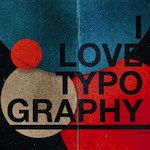 Feeling Responsive uses Volkhov for headlines, Lato for everything else and if you are in need to show some code, it will be in Lucida Console or Monaco.
Read More ›
Feeling Responsive uses Volkhov for headlines, Lato for everything else and if you are in need to show some code, it will be in Lucida Console or Monaco.
Read More ›
design – Discussion
Now with Comments!
 For a blog you need comments. Like all those other jekyll themes we baked in Disqus. It's easy to set, it works and makes a static jekyll blog more dynamic.
Read More ›
For a blog you need comments. Like all those other jekyll themes we baked in Disqus. It's easy to set, it works and makes a static jekyll blog more dynamic.
Read More ›
design – Headers With Style
No Header
Feeling Responsive allows you to use all kinds of headers. This example shows no header at all. Just the navigation. Read More ›
design – Headers With Style
No Header but Article Image
Feeling Responsive enables you to get the attention of visitors. If you don't want to use a big header, use an image for the article instead. Read More ›
design – Headers With Style
Header With Text
Feeling Responsive allows you to use all kinds of headers. This header is with text. Read More ›
design – Headers With Style
Header With Logo Only
Feeling Responsive allows you to use all kinds of headers. This is the default mode. It shows a header just with your logo on the standard background. Read More ›
design – Headers With Style
Header Image With Background Color
Feeling Responsive allows you to use all kinds of headers. This example shows a header image with a defined background color via front matter. Read More ›
design – Headers With Style
Header with a Full-Width-Image
 Feeling Responsive allows you to use all kinds of headers. This example shows a header with a full-width-image.
Read More ›
Feeling Responsive allows you to use all kinds of headers. This example shows a header with a full-width-image.
Read More ›
design – Headers With Style
Header Image With Pattern
Feeling Responsive allows you to use all kinds of headers. This example shows a header image in front of a pattern. Read More ›
design – Templates
Responsive Galleries with Foundation
 Wanna create a responsive gallery to showcase your portfolio, recent photos or images? It's quite easy thanks to Foundation and Clearing Lightbox.
Read More ›
Wanna create a responsive gallery to showcase your portfolio, recent photos or images? It's quite easy thanks to Foundation and Clearing Lightbox.
Read More ›
design – Templates
Video Template
If you want to show videos in a large manner, the video template is the right choice. Read More ›
design – Multi-Device Layouts in Color
Grid & Colors
Create powerful multi-device layouts quickly and easily with the 12-column, nest-able Foundation grid. To optimize the size of your images, you find the correct dimensions beneath. Further below you find the colorscheme and colors used for Feeling Responsive and their color codes.
Read More ›
design – Portfolio
Show your beautiful work!
With Feeling Responsive you don't need a special portfolio template. Just check out the great possibilities of the foundation grid and experiment with it. Read More ›
design – Multi-Device Layouts
The Full-Width Page Template
The full-width page format gives you all the space you need to show your content using the grid. Read More ›
design – Templates
Page/Post Right Sidebar
 This is an example of page/post with a sidebar on the right.
Read More ›
This is an example of page/post with a sidebar on the right.
Read More ›
design – Templates
The Post/Page Template
The default template for posts and pages aligns the page beautifully in the middle. But you can customize posts/pages easily via switches in the front matter to get a sidebar and/or to turn off meta-information at the end of the page like categories, tags and dates. Read More ›
design
Breadcrumbs
If you need them, Feeling Responsive offers you a breadcrumb navigation. You can easily turn it on/off via frontmatter. Read More ›
design – Templates
Page/Post With Left Sidebar
 This is a example of page/post with a sidebar on the left.
Read More ›
This is a example of page/post with a sidebar on the left.
Read More ›